I've already talked a bit about how I'm handling the layout of the new tileset, with offset tiles and overlays and different objects for walls and floors etc... In this post I want to talk a bit about how I make the textures, and what I've learned from the first (partially successful) generation of tilesets.
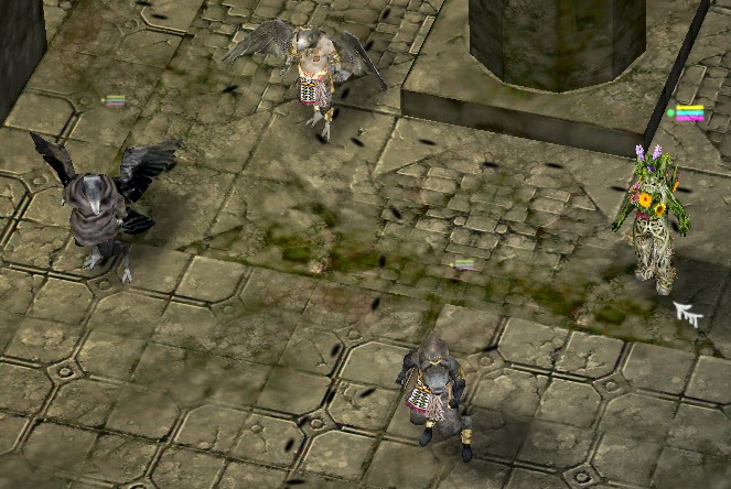 |
| Experiments with using different lighting for tiles and characters. |
If I wanted I could continue to make the game using the old style of tilesets, they're not that bad, but they just don't satisfy me. I know they could be much better and I've learned a lot in the last 2 years that I'd like to include in a revision of the tilesets.
Some of the things I want to consider when making the new tilesets are:
- Don't make doorways "covered", the doorway area should be open to the sky, otherwise it's difficult to arrange your characters in a doorway, somewhere where combat is very likely to take place. In the MKI tilesets I made the doorway like a tunnel, it looks nice but it interferes with play.
- Don't make the walls too high. We can imagine high ceilinged rooms, but
if we actually make them it can obstruct our view of the characters. It
is possible to write a script to remove blocking walls from view, or
have things such as arches or upper parts of walls become transparent
when you walk in to a room, but it's best to start with low walls and
work from there. Just make sure they are at least as tall as your
character or it will feel strange.
- Don't make the textures too detailed, or too high contrast. The tileset is supposed to be background, you don't want to lose important characters or items in an over-busy texture. I've been doing experiments with using different lighting ranges for tiles and characters (Tiles: 0.0-0.3, Characters 0.0- 1.0) this really brings out the characters from the background. Interactive objects should stand out like painted miniatures, while everything else should fade in to the background. It's not realistic, but I'm not looking for total visual realism in such a game, it's supposed to be somewhat stylized without being cartoony. Our point of view is like that from a window in a tall building looking down at the street. It would be easy to lose track of who is who and what they are doing from such a vantage point if we adhere directly to photorealism, especially in a dark, cramped dungeon.
- Avoid creating lots of unique texture/tile variations for a single tileset. It's better to create several tiles which look very similar but are subtly different. The human eye will quickly see when two tiles are identical, but will be fooled if most tiles are similar but different. When faced with a mostly homogeneous map, our minds will fill in the details, our imaginations will do the work for us. If the map is too cluttered with unique texture or fussy details our minds will block it out and all that hard work will be wasted.
- Try not to use mirrored or rotated textures too much. This can save on texture space, reducing texture sizes or giving higher resolution textures, but it is very obvious and quite ugly. It's better to have lower resolution but nicer textures.
- It's important to do some post processing on your base textures. One
thing that can improve them astronomically is to bake shadows and
ambient occlusion, for this, first create a prototype of physical parts
of your tileset and make sure there are no places where texture space is
duplicated or repeated. Later you can do this, but for the baking it
will cause artifacts and strange results.
- Instead of using a single complex texture, use two simple ones and mix them together using a perlin noise mask which repeats at the same size as your tilesets (in this case 16x16 blender units). I've already done this with more recent versions of the MKI tilesets and it really makes it look more alive. The wear and tear looks integral to the tiles, rather than just being painted on. The best way to do this is by mixing the textures on the prototype tileset and then baking them in your 3d engine. The end result will be the same as you'll see in game.
When it comes to making the textures for the tilesets, I already have a good workflow which I will be modifying, but mostly continuing. First I create a texture mask:
 |
| Each color is a different type of material. |
Red is "wood", blue is "recessed wood", Yellow is "plain stone", green is "recessed stone", white is "metal" magenta is "detailed stone or brick" etc...
I then feed this in to a procedural texturing program (I'm using
MapZone, a somewhat old but free program but you can find others or even write your own).
This splits each material in to a separate layer and then procedurally paints the layer to your specifications. You can use stock images or procedurally generated textures, both give good result. At first I used to do this by hand in The GIMP, but I've found procedural texturing so much faster and easier. If you change the layout of your tilesets, for example moving or enlarging a door or window, you can just feed the edited layer texture mask back into the program to get an instant result.
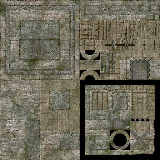 |
| After running it through the generator. |
Hopefully with all these points in mind, the future MKII tilesets should be a real improvement on the old ones.

Comments
Post a Comment